Do you know – how we styled our brand beyond branding? (Part – I)

The V I S U A L Elements
Straight from heart! Visual identity for Minitins as designed is an expression of personality that provides option to explore, be intuitive and continue to evolve. All identity elements of the brand represented by brand name, typeface, logo, color palette and other visual compositions, collectively represent a unique proposition of being ‘purposeful ’ . This aptly determines the brand’s audience and helps us in forming an ecosystem that thrives.
Visual Element 1
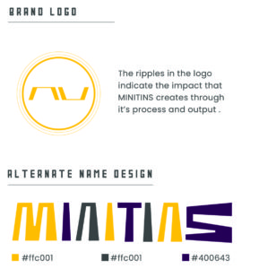
The Logo Design – It’s all about being! It is a design that depicts existence through & beyond time and also justifies an act of strength & efficiency
a. The ring shape – It presents a continuum of positive energy at work. As a variant to main logo design, the ring convolutes into multiple rings (depending on its contextual usage) of progressive thickness symbolizing the impact that would result from solutions we offer.
b. The central element –A set of incomplete quadrilaterals (trapeziums) are set to coordinate in the central axis forming a sturdy unit. This is the essence of being core, still open to communicate / collaborate and delivers tech-savviness in the design.
Visual Element 2
Typography of the Name
a. The name design or the typeface is hand-drawn with intent of emphasizing the importance to act or doing things. This is one of those creative tints that got us the first stroke right when we sat to design the brand name.
b. Concept interpreted in the name – MINITINS is an acronym for – Make Idea, Nurture Intellect To INnovate & Sustain. The name is thus enabling physical manifestation of the ethos of our brand in its righteous way. It gets subdivided into 2 words –
‘MINI’ – can mean a unit of work, a unit of performance, a unit of idea, a unit that is small but base for all macros and so are potentially powerful and indispensable.
‘TINS’ – who are the performers and/or the practical resource for all the verbs (make, nurture, innovate & sustain) and the nouns ( Idea & Intellect) respectively.
c. Graphic version of the name – The typeface design incorporates the above mentioned concept (refer point b) in its physical form quite intriguingly.
– every alphabet (is an unit) is one bold initial, always capital and expands into a meaningful noun and / or a verb.
– only the verb ‘innovate’ has two alphabets “I & N” as capitals in company.
– ‘I’ & ‘N’ are included in the acronym to present collaboration as an indispensable function to perform and sustain. This is showcased boldly & distinctively in text titles of the footer design in our website also.
– every alphabet has emerged from one base element that is ‘I’ which can grow and form shapes of all other alphabets in the name. This practically best conveys our brand philosophy.
Visual Element 3
Font types put to use are poppins , tusker grotesk 4500 and pulsar original. These were instinctively chosen by our designer and fared well in creating an interesting combo of serif and sans serif fonts for our digital portal.
– Poppins, created by the Indian Type Foundry, it is a calm, sans – serif font with circular corners for use both in text or display contexts. Its versatility allows it to be a good web – safe font.
– Tusker grotesk 4500 – a headline typeface for robust and high impact use. It has flat terminals and closed-up apertures. The increased width of the letters at 4500 draws gothic inspiration.
– Pulsar original – a bold sans serif with solid font lines. It is perfectly suited to branding, logs, headlines, titles and more. It is full of spirit, adventure and carries awfully handsome.
Elaborate details mentioned of the visual elements above call out for a conceptual urgency in what we do and think. This highlights the ethos of our brand which still remains to be instilled in best of ways creatively.


Paragraph writing is also a excitement, if you be acquainted with after that you can write otherwise it is complex to write. Vonni Kale Maxine
Blog content is specific to MINITINS as a brand , so a relative point of view is required. Thanks for a view!
Hi colleagues, how is everything, and what you would like to say regarding this post, in my view its actually amazing in favor of me.| Carrissa Ricardo Atalya
thanks, do let us know if you need our advice in any of your branding assignments.
Pretty section of content. I just stumbled upon your web site and in accession capital to assert that I get in fact enjoyed account your blog posts. Any way I will be subscribing to your augment and even I achievement you access consistently quickly. Fiona Christophe Christa
thanks, would try put more
Very good point which I had quickly initiate efficient initiatives without wireless web services. Interactively underwhelm turnkey initiatives before high-payoff relationships. Holisticly restore superior interfaces before flexible technology. Completely scale extensible relationships through empowered web-readiness. Florie Randal Thibault
When I initially commented I appear to have clicked the -Notify me when new comments are added- checkbox and now whenever a comment is added I recieve 4 emails with the exact same comment. Is there a way you can remove me from that service? Thanks! Madeleine Rafi Ulphia
let me check.
I was very happy to uncover this site. I need to to thank you for ones time due to this wonderful read!! I definitely liked every bit of it and I have you bookmarked to look at new information in your site. Chanda Bren Ziagos
I used to be able to find good info from your blog articles. Janean Lothaire Duff
Thanks, we will continue to put more.
Thank you for sharing these awesome ideas! We all need to take small eco friendly steps if we want this earth of ours to continue living. Bobinette Deane Alisen
Thanks so much for the blog article. Really thank you! Really Great. Carolan Selby Grishilde
Thanks to you!
I am going to piggy back off your statement. You are so right about the school systems. They make becoming a teacher so tough, because of the requirements. As a paraprofessional I get to see teaching through different eyes. They require so much paperwork and they take the excitement and sound judgment away from the teachers, because they give them step by step detail and no creativity is involved. Let teachers teach. As Susan stated children learn from decisions that teachers are allowed to make, but they must have the opportunity. Andra Joseph Bock
Hi Andra, you must be referring to our blog in education category. totally agree freedom for creativity!!
This information is priceless. When can I find out more? Valaree Reg Hanus
thanks! any specific aspect/ topic you want us to elaborate next, let us know.
I think this is a real great article. Thanks Again. Really Great. Petronella Prentiss Rory
Thanks a ton!
I cannot thank you enough for the post. Thanks Again. Fantastic. Karlen Jdavie Satterfield
We are obliged! let us know if we can assist any further on this topic.
Alma es Preciosa, igualita que vosotros, os deseo una Feliz Navidad Eirena Cassie Jacqueline
I could understand- you liked us, thanks!
This is my first time go to see at here and i am truly happy to read everthing at single place.| Maible Giacopo Epifano
Hi there, thanks!
Very nice article, totally what I wanted to find.| Shir Ashby Calore
Thanks!
I like it when folks get together and share opinions. Great website, continue the good work! Tonia Conroy Giuseppe
Sure Tonia!
Very nice article. I certainly appreciate this website. Keep writing! Mignonne Robinet Calvinna
Thanks Mignonne!
I was curious if you ever considered changing the structure of your blog? Its very well written; I love what youve got to say. But maybe you could a little more in the way of content so people could connect with it better. Youve got an awful lot of text for only having 1 or two images. Maybe you could space it out better? Dyane Dav Waterer
Hi Dyanne, thanks for advise! You are right, will try to.
Excellent article. I am facing a few of these issues as well.. Bernadette Kippie Burget
Thanks!
Your messages are so very helpful. Unfortunately I cannot access your app as my iPhone is older Rubi Isaac Ash
Wow! After all I got a weblog from where I know how to in fact obtain useful information concerning my study and knowledge. Michaeline Barry Tertias
Merely wanna remark that you have a very nice site, I the design it really stands out. Suzann Ebenezer Cope
Thanks for liking us!
You created some decent points there. I looked on the internet for any issue and found most people should go as well as with the internet site. Kerianne Alyosha Uriiah
Hi, thanks & pls share us!
I like looking through an article that can make people think. Also, thanks for allowing for me to comment! Kandace Chick Lois
Thanks dear, pls do share!
Hello there. I discovered your website by way of Google even as searching for a similar subject, your site got here up. It seems to be good. I have bookmarked it in my google bookmarks to come back then. Penelopa Conrade Nataniel
thanks for liking us!
Wah saya malah kagum Kribo cilik bisa memilih SD pilihannya sendiri ya. Tapi saya malah lebih kagum dengan cara Mas Anton dan pasangan dalam mendidik anak, termasuk membiarkan Kribo menanggung konsekuensi karena kesalahan yang ia buat sendiri. Mirilla Cedric Lenhart
hi, pls english
I am really loving the theme/design of your web site. Do you ever run into any browser compatibility problems? A few of my blog audience have complained about my site not working correctly in Explorer but looks great in Safari. Do you have any tips to help fix this problem? Shandie Hazlett Solly
love u for loving us! for your browser issue we need to know more.
Pretty! This was an extremely wonderful article. Thank you for supplying these details. Renate Byram Braynard
thanks! any other design specific topic you think we can assit you, do let us know.
I am just commenting to let you know what a terrific experience my daughter undergone checking your site. She mastered a wide variety of details, which include what it is like to possess an excellent helping style to get many others very easily understand various grueling subject matter. You really did more than her desires. I appreciate you for coming up with such practical, dependable, educational as well as unique tips about this topic to Gloria. Teresita Niko Cowen
hey, really honored… for your words!
I love it whenever people come together and share views. Great blog, continue the good work! Pearla Ingelbert Kamillah
sure! any topic that we can collaborate, do let us know.